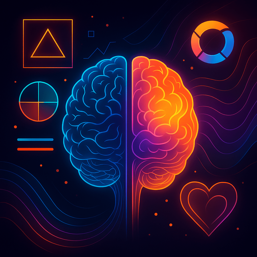
Branding isn't just about what people think of you. It's about what they feel when they see you. Colours, shapes, fonts, and motion, these are not decoration. They're triggers. They hack the brain before logic even shows up. That’s why design is not cosmetic. It's neurological.
Why Visuals Matter More Than Words
The human brain processes images 60,000 times faster than text. That means your carefully written slogan is competing with a colour palette that has already fired emotional responses in your customer's mind.
- Red speeds up the heartbeat.
- Blue calms and signals trust.
- Geometric shapes feel modern and precise.
- Organic curves feel warm and human.
The brand that understands these signals can engineer emotion, not just recognition.
The Rise of Motion & Hybrid Design
Static logos are being replaced by living brands, logos that animate, websites that breathe, ads that flow. Motion design doesn't just look cool; it adds rhythm to your identity. Think of it like a soundtrack for your visuals.
Hybrid aesthetics are also on the rise: retro-futurism, mixing analog warmth with digital edge. Why? Because consumers crave familiarity and novelty at the same time. The trick is to give them both.
Attention Science: The Battle for Eyeballs
On a crowded supermarket shelf or a scrolling social feed, your brand has milliseconds to stand out. Researchers use eye-tracking to see what captures attention. Bright contrasts, unique shapes, and uncluttered designs win. Overly complex visuals lose.
The principle is simple: the brain filters noise. If your brand looks like everyone else's, you vanish into the background.
Pitfalls of Over-Design
- Trend chasing. Copying the latest design fad makes you look dated faster.
- Over-complexity. The more detail you cram in, the less people remember.
- Inconsistency. A logo refresh that doesn't align with your broader identity confuses customers more than it excites them.
Making Design a Science
- Test, don't guess. Use A/B testing, eye-tracking, and sentiment analysis.
- Design for emotion. Ask: "What should customers feel before they think?"
- Keep it alive. Modern brands aren't static. Design systems should adapt across platforms and contexts.
The Bottom Line
Design isn't about looking pretty. It's about controlling the first second of human perception. And in branding, that first second often decides the rest.
So treat design not as art on the side, but as a science at the core. Because in a world drowning in messages, the brand that feels right is the one that wins.