The simplest definition
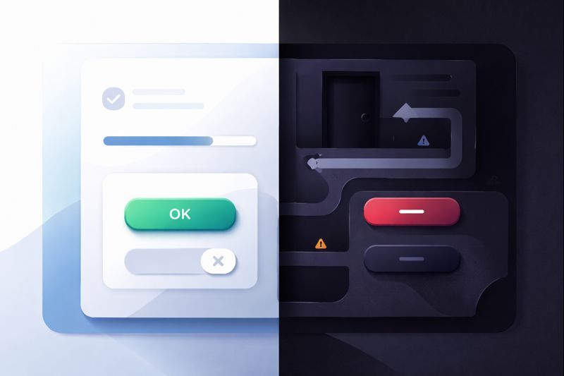
A dark pattern is an interface that is designed to push a user into an outcome that benefits the business by exploiting how humans decide, rather than by improving value.
Neutral choice = clear options + symmetric effort + honest consequences
Dark pattern = biased cues + hidden costs + asymmetric effort
If the outcome would vanish the moment you make the trade-offs fully transparent, it was never persuasion. It was concealment with a paint job.
First principles: what’s actually being “hacked”
People do not calculate decisions like a spreadsheet. They make fast judgments using shortcuts. This is efficient. It also makes us predictable.
Humans rely on cues
- Defaults: “If it’s preselected, it’s probably right.”
- Loss aversion: “Don’t lose what you almost had.”
- Urgency: “If time is running out, act now.”
- Social proof: “If others did it, it must be safe.”
- Confusion avoidance: “Choose the path with less mental work.”
Dark patterns weaponise those cues
- They increase friction for the user-friendly choice.
- They reduce friction for the business-friendly choice.
- They hide information until after commitment.
- They frame language to create guilt or fear.
- They shift attention away from consequences.
A practical test: “Would this survive daylight?”
Here is a quick diagnostic you can run on any flow.
Daylight Test:
1) Make every consequence explicit before the user commits.
2) Make "Yes" and "No" equally visible and equally easy.
3) Remove guilt language and remove fake urgency.
If conversions collapse, the design was doing the selling, not the product.
Dark patterns often look like “growth tactics” because they inflate conversions. They also inflate churn, complaints, chargebacks, and distrust.
The common types, explained like mechanisms
Friction Trap Roach Motel
Entry is one click. Exit is a scavenger hunt. This works because the brain discounts future effort. You sign up now and “deal with cancellation later”. Later becomes never.
Hidden Cost Sneak into Basket
You commit to a price, then new costs appear. The trick is anchoring. Your mind locked onto the first number. Every add-on looks “small” compared to the anchor.
Language Weapon Confirmshaming
The “No” option is phrased as a confession: “No thanks, I hate saving money.” The interface uses shame as a substitute for value.
Fake Signal False Urgency and False Scarcity
Timers and “Only 2 left” badges trigger loss aversion. The user is no longer evaluating the product. They are reacting to the fear of missing out.
Wearing You Down Obstruction
Extra steps, repeated prompts, or forced detours that exist for one reason: to exhaust the user. Eventually the user chooses whatever ends the session.
Privacy Extraction Privacy Zuckering
Sharing is the default. Opt-out is hidden. Wording is vague. The user trades privacy for convenience without understanding the price.
Silent Contract Forced Continuity
A “free trial” becomes a paid subscription unless the user cancels at the right time. The pattern relies on forgetfulness and calendar blindness, not satisfaction.
Why teams slip into dark patterns
Most teams do not set out to be villains. They set a metric and remove everything that blocks it. If the only scoreboard is conversion, the system will evolve tricks.
Rule: What you measure becomes what you build. Measure only short-term conversion and you will eventually build deception.
Add time to the equation and the “growth hack” becomes visible as debt: churn, support costs, reputation damage, chargebacks, regulatory exposure, and lower lifetime value.
The AI twist: dark patterns that adapt to you
Traditional dark patterns are static. AI makes them personalised.
- Adaptive copy: the system learns which wording triggers you.
- Dynamic friction: cancellation becomes harder only for high-value users.
- Opaque personalisation: prices, offers, and defaults shift without explanation.
When a system optimises for behavioural compliance at the individual level, it crosses from “persuasion design” into behavioural exploitation.
Clean alternatives that still convert
Ethical design is not “be nice”. It is alignment: win by delivering value, not by hiding terms.
Replace deception with clarity
- Show total cost upfront, including fees.
- Use plain language, no guilt framing.
- Explain why you need permissions, in one sentence.
- Make cancellation as easy as sign-up.
Use fair choice architecture
- Symmetric buttons: “Accept” and “Decline” equal weight.
- Defaults that match user interest, not extraction.
- Consent that is granular and reversible.
- Reminders before billing events.
A final model to keep in your head
You can think of every product flow as a small machine.
Input: user intent + attention + trust
Machine: interface + incentives + friction
Output: action taken

Good design improves the machine so the output matches the user's intent.
Dark patterns rewire the machine so the output matches the business's intent.
If you want durable growth, optimise for the output that survives full transparency. Anything else is just a conversion spike with a delayed invoice.